Tech History: Cisco’s Name and Logo
The other day I was driving around with Emily, and I mentioned to her the origin of the name and logo of Cisco Systems. Â I can’t remember how it came up, but it did. Â I’m constantly tinkering with stuff in my lab, so she knows what the logo looks like even though it isn’t her field at all. Â Her mind was a little blown when she made the connection between the logo and its origins. Â I mentioned this to a couple coworkers, and they hadn’t heard the history behind it either. Â Their minds were also a little blown. Â So I thought I’d post it here, because that’s what the internet is for. Â Posting random crap, I mean… Â Not Cisco history.
1) Cisco: short for San Fransisco.
Found this snippet below a couple websites, with sources leading back to cisco.com. Â The link was identical on the sites, but was broken. Â And cisco’s search function only really returns technical articles regardless of how hard I searched. Â but…
Cisco Systems is the world leader in manufacturing of Network related equipment. The name “Cisco” is not an acronym, but an abbreviation of San Francisco. According to John Morgridge, employee 34 and the company’s first president, the founders hit on the name and logo while driving to Sacramento to register the company — they saw the Golden Gate Bridge framed in the sunlight.
The name cisco Systems (with the lowercase “c”) continued in use within the engineering community at the company long after the official company name was changed to Cisco Systems, Inc. Users of Cisco products can still see the name ciscoSystems occasionally in bug reports and IOS messages.
2) Cisco’s logo IS the Golden Gate Bridge
Exhibit A:
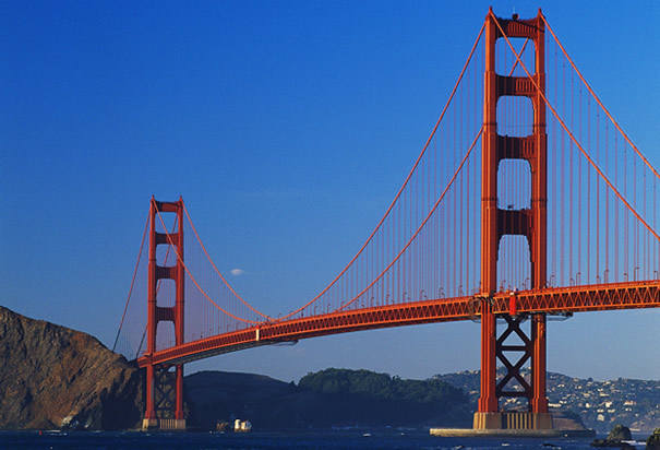
Exhibit B:
![]()
From the internets as well, a different but similar account of the above story:
According to John Morgridge, the company’s first president, the founders Len Bosack and Sandy Lerner hit on the name and logo while driving to Sacramento to register the company. They saw the Golden Gate Bridge framed in the sunlight. The logo was seen by them as a modified version of the past that would shape the future. Plus it looked really “coolâ€. They hoped the logo would convey something about creating an authentic life and making a living at something you believe in, in a place you love, with people you really like to be with.
I couldn’t find any working links back to cisco.com in the 15 minutes I spent searching around, but many sites mirror the same story. Wikipedia references what appears to be one of the sources over at famouslogos.us. So while I can’t link a solid article from Cisco at the moment, my magic 8-ball tells me “all signs point to yes”
Or, more accurately, Cisco’s logo USED TO BE the Golden Gate Bridge. Losing the parabolic curve of the suspension cables leaves us with… A city receding into the distance? Mountain peaks rising through the clouds? Two stealth bombers?
In this case, less is less. Big step backwards.